
A deep dive on this case study is best experienced on a big screen
Go back to portfolio

PIXEL CREDIT CARD
How did a simplified User Experience led to fewer support tickets
My Role
I led the repayment redesign on HDFC's Pixel card, built on Zeta — turning a confusing pay flow into a predictable one.

My Role
Senior UX Designer

Duration
2 Weeks

Focus
Product and Design
What is Pixel credit card

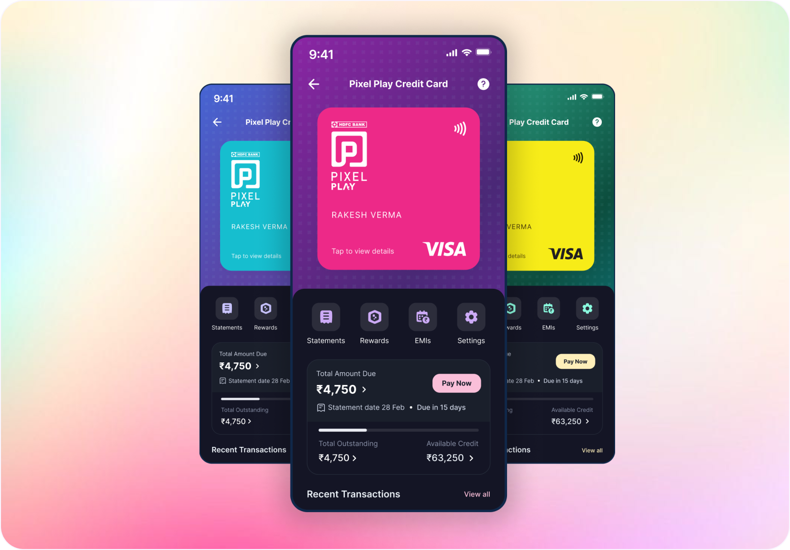
Pixel is HDFC Bank's digital-first credit card, built fully on Zeta's platform.
Fully digital issuance and management — the whole card lives inside the app.
Delightful features like choice of card theme and DIY Rewards.
What was going wrong?
Repayment was quietly flooding support
Imagine you are a user who got a
new credit card
You start using it for your payments and earning rewards, but when it’s time to pay it back, suddenly you just can’t.

you’re confused how should I repay my statement
The repayment date is coming closer, So, as a last-mile effort, you reach out to the CS Team.

Discovery
Investigating the problem
Working alongside Customer Success Team, we found repayment pain concentrated in three ticket clusters:
15%
where and how do I pay
12%
statement date & due-date confusion
13%
paid late, then charged a late fee
40%
of all CS ticket inflow traced back to repayment.
Behavioural baselines
only ~15% of users ever clicked the pay button, and 20% of repayment attempts were failing outright.
Discovery
Understanding the why
Three lenses, deliberately chosen to cross-check each other, so no single signal could mislead us.

Qualitative
VOC analysis in Freshdesk — reading tickets for recurring patterns.

Systemic
An internal audit of every repayment & statement touchpoint.

Behavioral
Repayment funnel data, where attempts succeeded vs. failed.
Discovery
Our Findings
Finding 1
Users were not aware of the pay button on the Pixel Homepage
What did the VOCS SAY?
They called out that they did not know where in the app they can repay the statement
How We Validated this?
We looked at how many users were interacting with the pay button, and the unique clicks were around 15% monthly, which is very low for a Credit product
Finding 2
Users were not aware of their payment due date and statement date. On top of that, no payment reminders were being sent to them.
What did the VOCS SAY?
They were not able to say payment due date, no autopay option and lack of reminders were adding to frustration
How We Validated this?
To Validate this we did a UX audit of the app
Finding 3
Once Repayment failed, user were not retrying the repayment, and dropping-off the flow
What did the VOCS SAY?
Repayment were failing on Pixel’s payment flow and most users were clueless why it was happening, they wanted support to pay the bill back as they didn’t wanna incur late payment fee charges and hit on their credit score
How We Validated this?
Looking at Repayment metadata, we figured 20% of repayments were failing, and we were not able to pin point the problem
Discovery
Auditing the Repayment experience
Audit 1
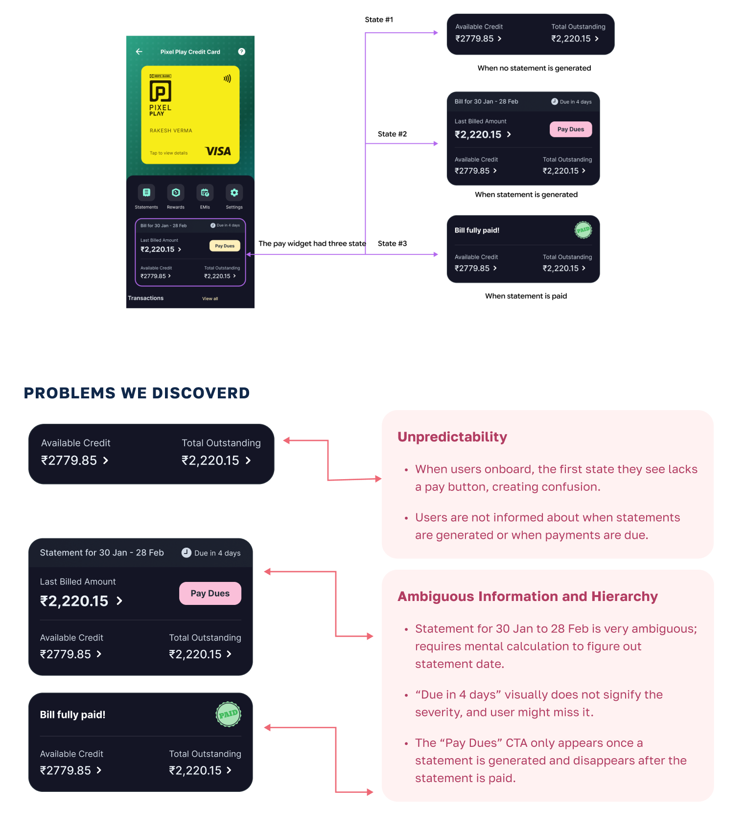
We decided to audit the pay widget. The initial pay widget had three states.
Audit 2
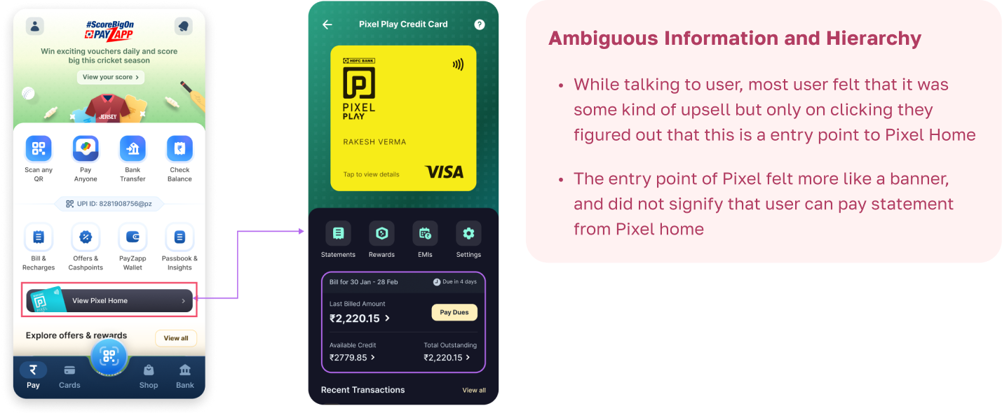
The entry point to Pixel homepage
Audit 3
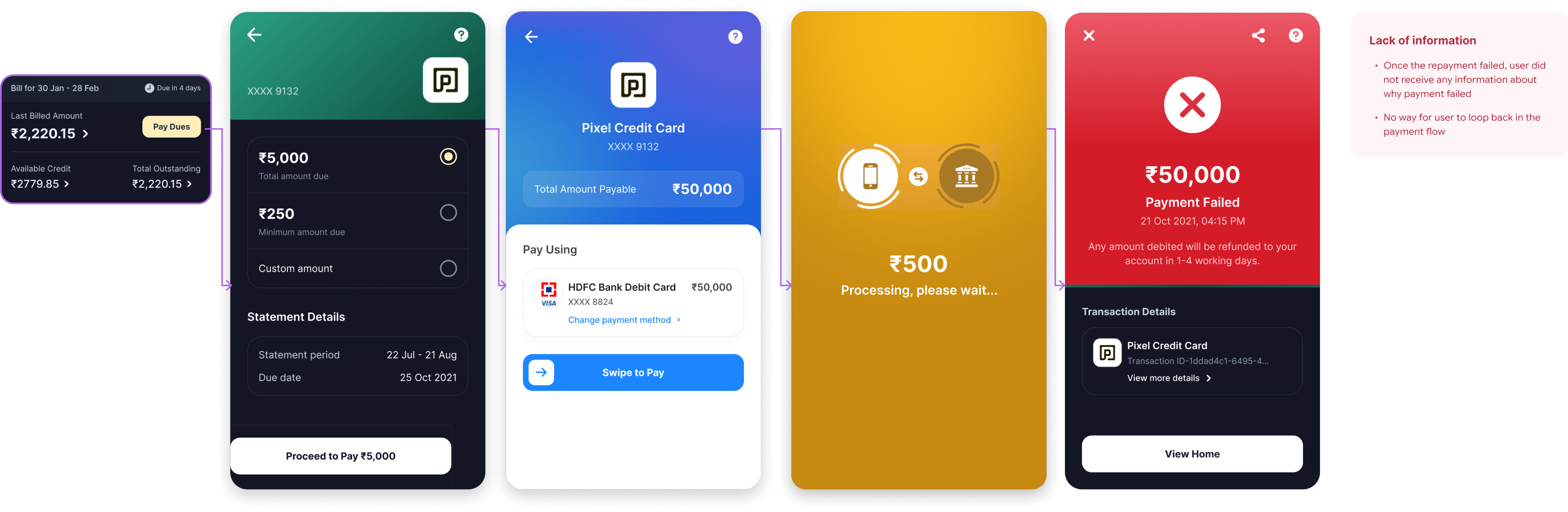
Problem with the payment error screen
Redefining the Problem
Based on research and discovery exercise we re-wrote the problem statement
Improve Discovery
How can we improve Pixel intervention point to educate user how they can pay the statement
Improve the Repayment Experience
How can we re-design the payment widget so that it is more predictable and clear
Give more Clarity on why payment Failed
How can we add quick UX fixes to the error screen so that user can get more information on why repayment failed
Pay Widget: Ideation
I looked at the credit card statement cycle and mapped real life scenario to understand why pay widget should be enabled
Additional use-cases Pay widget should support
Statement Cycle State
User Makes a paymnet
Spends are recorded as outstanding amount
No Statement is generated
Outstanding = Unbilled
User Scenerio
Scenario 1:
User has less limit
In this case user might exhaust entire credit limit before the statement in generated,
Scenario 2:
User needs Information
wants to know when is the statement is generated and when payment is due.
Scenario 3:
User just wants to pay in advance
Things pay widget should addressed
When is the Due date?
What is my Statement Period?
When is the statement Due?
What is the available Credit?
How much is outstanding?
How much is my Billed Due?
Mission Statement for Pay widget:
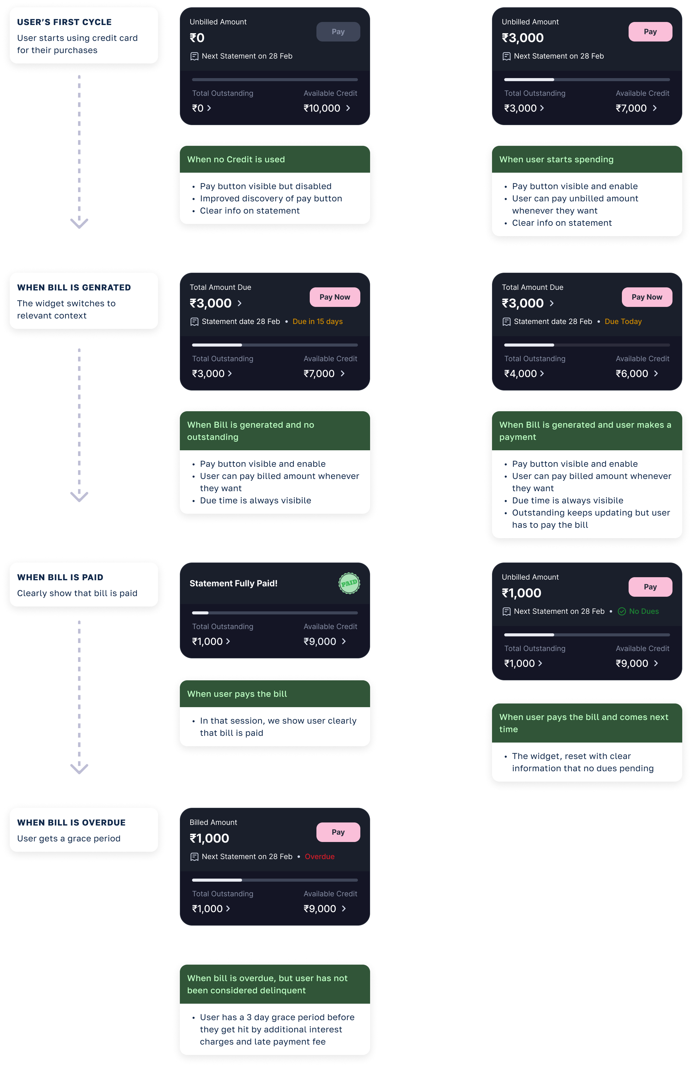
Let user PAY whenever they want
Pay Widget
Initial Exploration
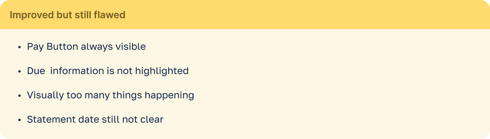
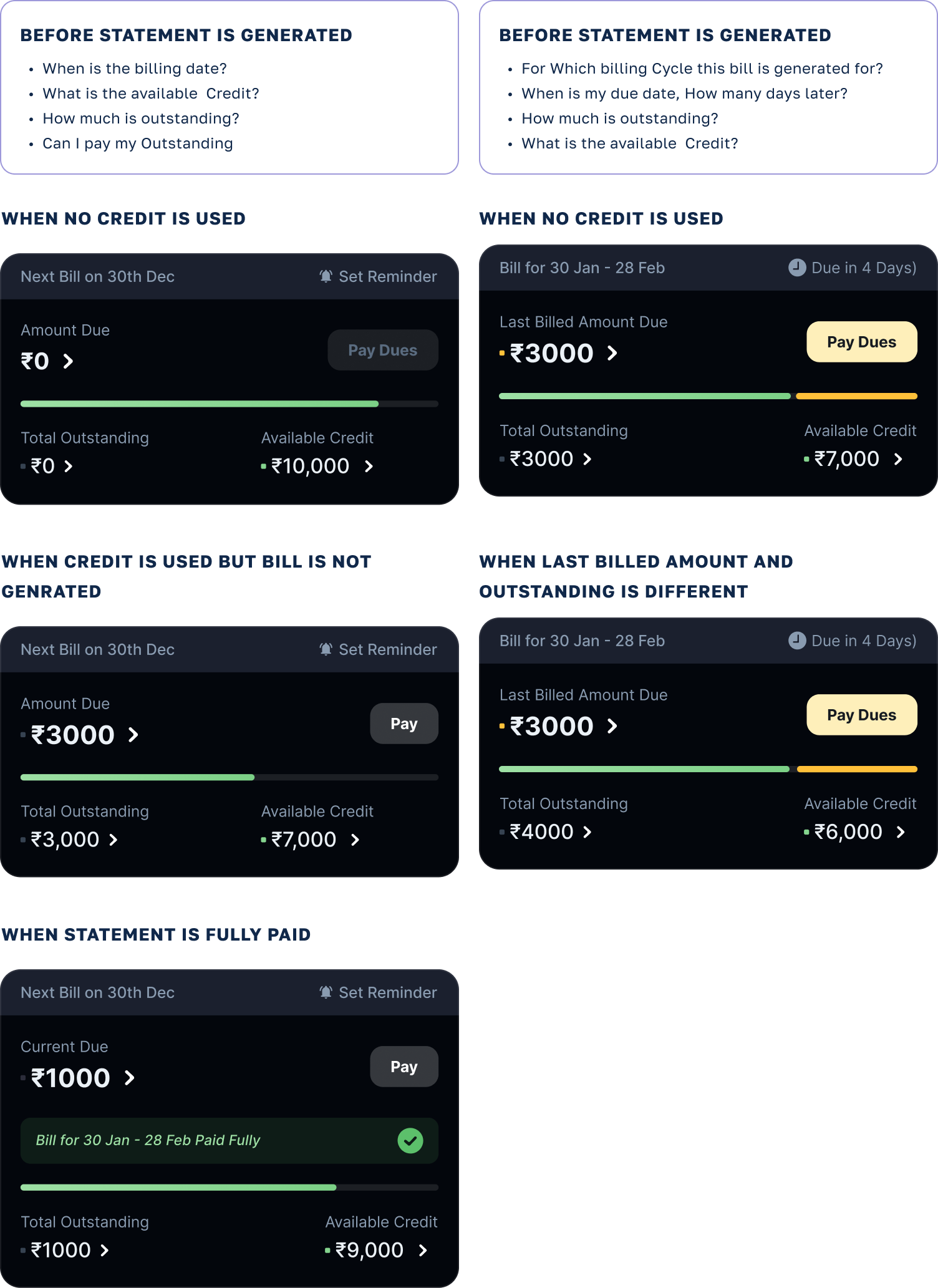
Pay Widget
Final Design based on feedback and usability testing
Redesigned Pay widget:
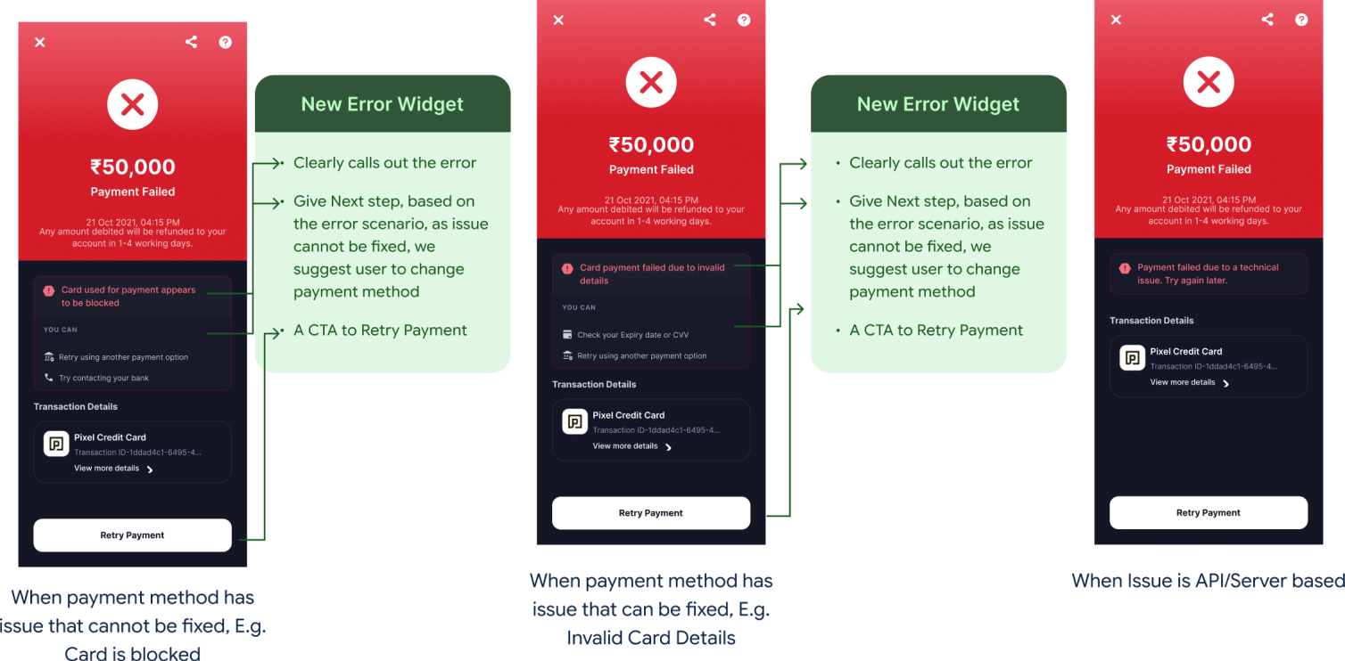
Error Screen: Ideation
I conducted session with my product counter part and Backend team to figure out, what was the reason for failure of repayments.
User Scenerio
Scenario 1:
When payment method has issue that cannot be fixed, E.g. Card is blocked
Scenario 3:
When payment method has issue that can be fixed, E.g. Invalid Card Details
Scenario 3:
When issue is API/Server based
Error Screen
Initial Solution
Added More Context to Error screen:
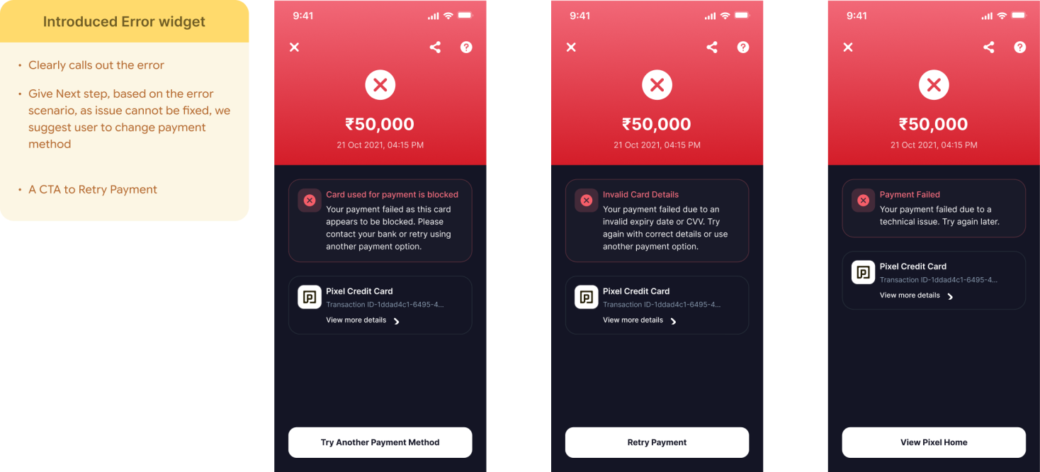
Error Screen
Final Solution
Added More Context to Error screen:
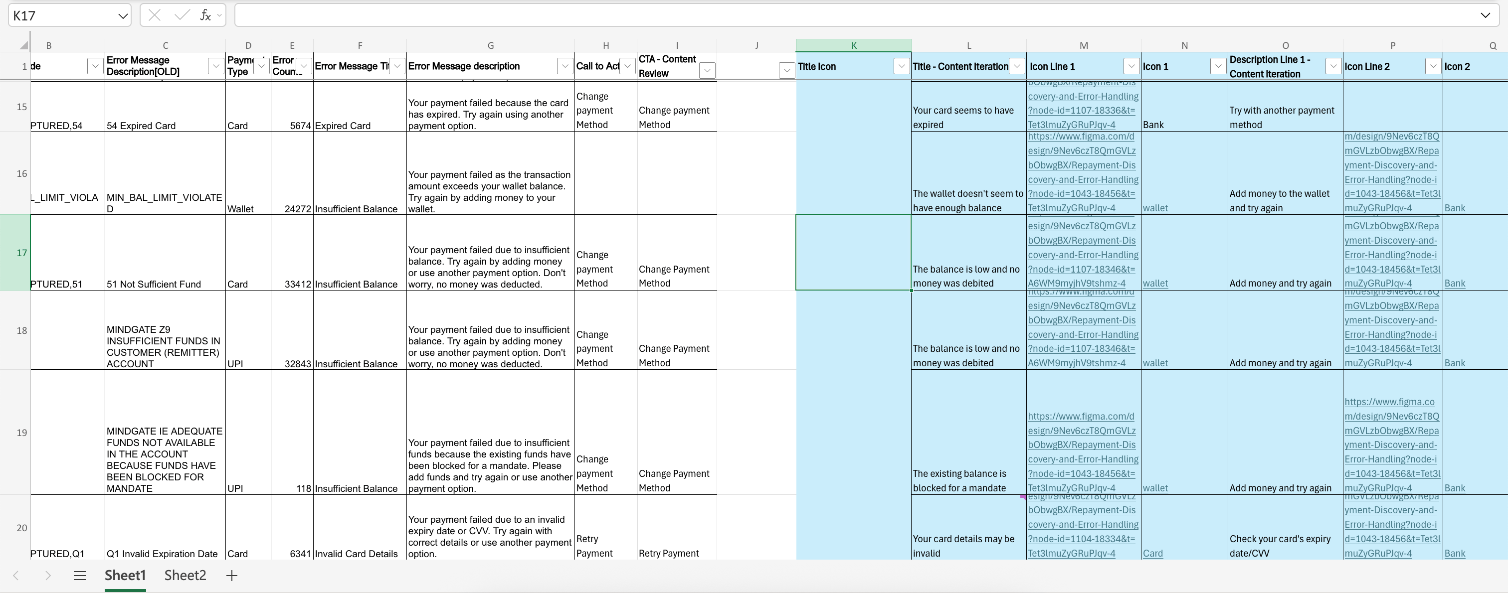
To ensure all error scenarios are covered, we created a record of all the error code and respective messages.
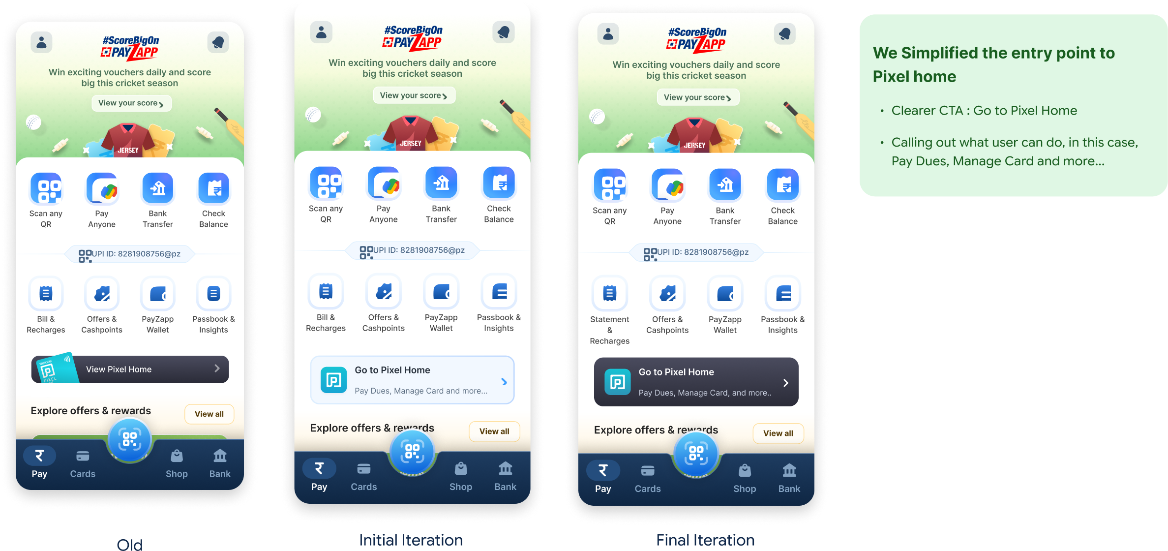
Discovery Entry point
Initial to Final Solution
Added More Context to Error screen:
#Impact
These enhancement led to some significant result
Our Internal and external stakeholders were happy with the changes, once the changes were done it led to
65%
of repayment/statement ticket reduced because of the Redesigned the pay widget
45%
of overall tickets got reduced because of the redesign of the new intervention point

Thank You
Feel free to reach out if you're interested in learning more about this case study!
Go back to portfolio
PIXEL CREDIT CARD
How did a simplified User Experience led to fewer support tickets
My Role
I led the repayment redesign on HDFC's Pixel card, built on Zeta — turning a confusing pay flow into a predictable one.
My Role
Senior UX Designer
Duration
2 Weeks
Focus
Product and Design
What is Pixel credit card
Pixel is HDFC Bank's digital-first credit card, built fully on Zeta's platform.
Fully digital issuance and management — the whole card lives inside the app.
Delightful features like choice of card theme and DIY Rewards.
What was going wrong?
Repayment was quietly flooding support
Imagine you are a user who got a
new credit card
You start using it for your payments and earning rewards, but when it’s time to pay it back, suddenly you just can’t.
you’re confused how should I repay my statement
The repayment date is coming closer, So, as a last-mile effort, you reach out to the CS Team.
Discovery
Investigating the problem
Working alongside Customer Success Team, we found repayment pain concentrated in three ticket clusters:
15%
where and how do I pay
12%
statement date & due-date confusion
13%
paid late, then charged a late fee
40%
of all CS ticket inflow traced back to repayment.
Behavioural baselines
only ~15% of users ever clicked the pay button, and 20% of repayment attempts were failing outright.
Discovery
Understanding the why
Three lenses, deliberately chosen to cross-check each other, so no single signal could mislead us.
Qualitative
VOC analysis in Freshdesk — reading tickets for recurring patterns.
Systemic
An internal audit of every repayment & statement touchpoint.
Behavioral
Repayment funnel data, where attempts succeeded vs. failed.
Discovery
Our Findings
Finding 1
Users were not aware of the pay button on the Pixel Homepage
What did the VOCS SAY?
They called out that they did not know where in the app they can repay the statement
How We Validated this?
We looked at how many users were interacting with the pay button, and the unique clicks were around 15% monthly, which is very low for a Credit product
Finding 2
Users were not aware of their payment due date and statement date. On top of that, no payment reminders were being sent to them.
What did the VOCS SAY?
They were not able to say payment due date, no autopay option and lack of reminders were adding to frustration
How We Validated this?
To Validate this we did a UX audit of the app
Finding 3
Once Repayment failed, user were not retrying the repayment, and dropping-off the flow
What did the VOCS SAY?
Repayment were failing on Pixel’s payment flow and most users were clueless why it was happening, they wanted support to pay the bill back as they didn’t wanna incur late payment fee charges and hit on their credit score
How We Validated this?
Looking at Repayment metadata, we figured 20% of repayments were failing, and we were not able to pin point the problem
Discovery
Auditing the Repayment experience
Audit 1
We decided to audit the pay widget. The initial pay widget had three states.
Audit 2
The entry point to Pixel homepage
Audit 3
Problem with the payment error screen
Redefining the Problem
Based on research and discovery exercise we re-wrote the problem statement
Improve Discovery
How can we improve Pixel intervention point to educate user how they can pay the statement
Improve the Repayment Experience
How can we re-design the payment widget so that it is more predictable and clear
Give more Clarity on why payment Failed
How can we add quick UX fixes to the error screen so that user can get more information on why repayment failed
Pay Widget: Ideation
I looked at the credit card statement cycle and mapped real life scenario to understand why pay widget should be enabled
Additional use-cases Pay widget should support
Statement Cycle State
User Makes a paymnet
Spends are recorded as outstanding amount
No Statement is generated
Outstanding = Unbilled
User Scenerio
Scenario 1:
User has less limit
In this case user might exhaust entire credit limit before the statement in generated,
Scenario 2:
User needs Information
wants to know when is the statement is generated and when payment is due.
Scenario 3:
User just wants to pay in advance
Things pay widget should addressed
When is the Due date?
What is my Statement Period?
When is the statement Due?
What is the available Credit?
How much is outstanding?
How much is my Billed Due?
Mission Statement for Pay widget:
Let user PAY whenever they want
Pay Widget
Initial Exploration
Pay Widget
Final Design based on feedback and usability testing
Redesigned Pay widget:
Error Screen: Ideation
I conducted session with my product counter part and Backend team to figure out, what was the reason for failure of repayments.
User Scenerio
Scenario 1:
When payment method has issue that cannot be fixed, E.g. Card is blocked
Scenario 3:
When payment method has issue that can be fixed, E.g. Invalid Card Details
Scenario 3:
When issue is API/Server based
Error Screen
Initial Solution
Added More Context to Error screen:
Error Screen
Final Solution
Added More Context to Error screen:
To ensure all error scenarios are covered, we created a record of all the error code and respective messages.
Discovery Entry point
Initial to Final Solution
Added More Context to Error screen:
#Impact
These enhancement led to some significant result
Our Internal and external stakeholders were happy with the changes, once the changes were done it led to
65%
of repayment/statement ticket reduced because of the Redesigned the pay widget
45%
of overall tickets got reduced because of the redesign of the new intervention point
Thank You
Feel free to reach out if you're interested in learning more about this case study!
Go back to portfolio